Iris Design System
A cross-platform UI component library for 3D modeling and visualization applications at nTop, custom built from the ground up.
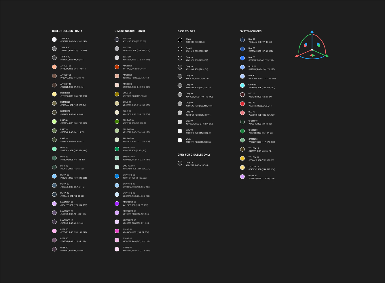
Color System
![]()
![]()
Type Icons

Function Icons
Desktop Icons
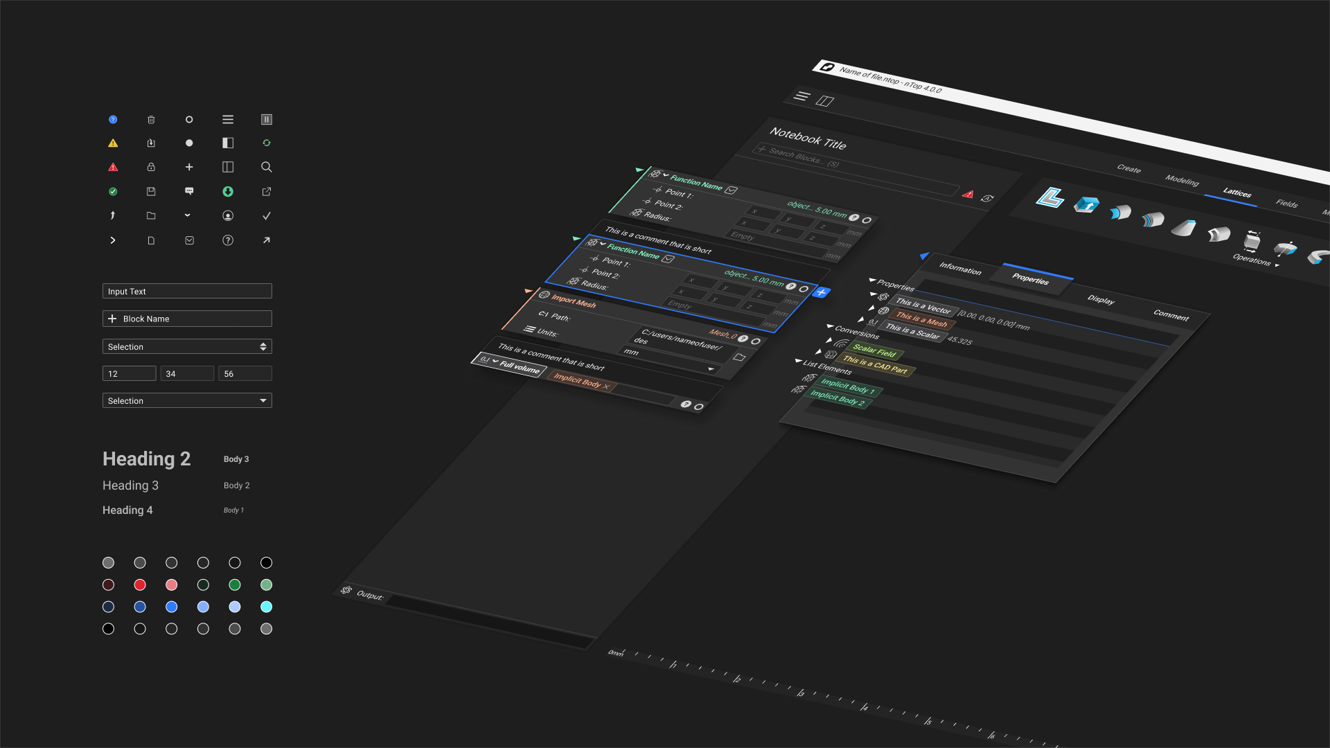
Core Components

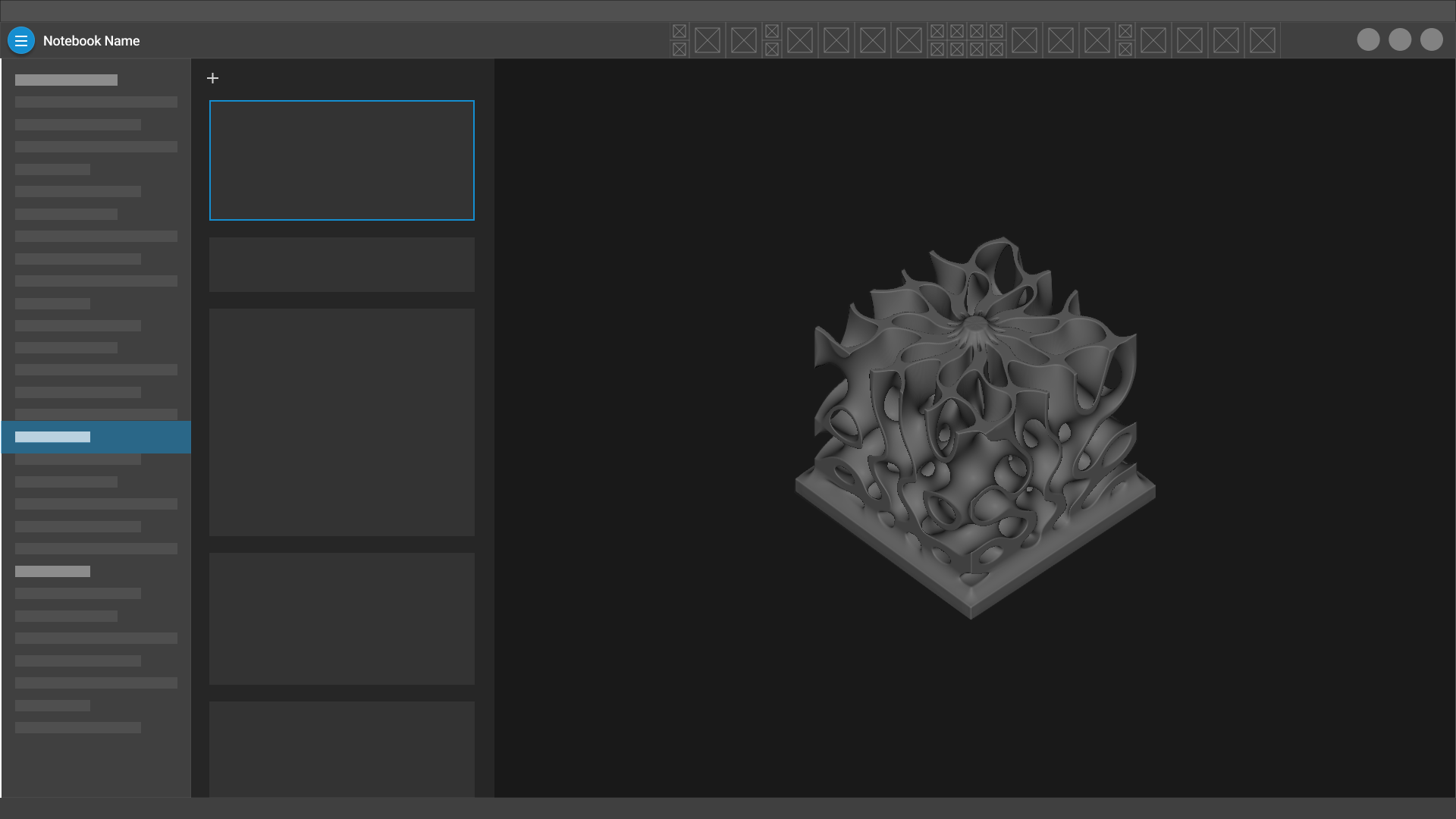
Notebooks
Panels

Application Layout
Notebook Outline
A UX strategy and set of UI components to mitigate complexity and enhance navigation for procedural design interfaces.

The Problem
The primary UI concept in nTop is the Notebook, an interface that is designed for constructing procedural 3D models, managing complex datasets, automating geometry, running simulations, and optimizing engineered parts. Although users spend most of their time using the Notebook interface, over time we observed that files were growing larger, the organizational methods for individuals were becoming more widely varied, and files were becoming more difficult to understand between individuals. We knew that in order to scale up usage, we needed to find a solution that simplifies the interaction with Notebooks and builds confidence with our user base.
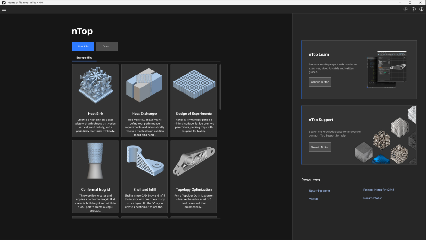
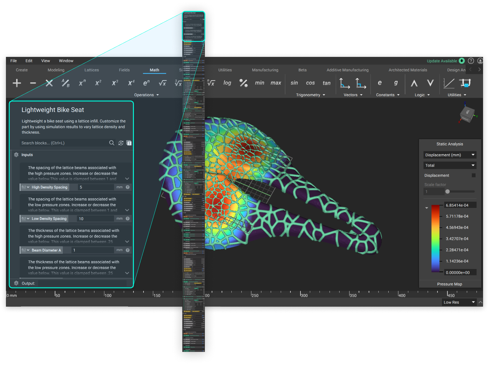 An example of a simple bike seat design made in nTop was only able to display about 10% of the model structure. In order to navigate the design to make changes, it required a large amount of scrolling, and in many cases, guessing, to understand the model and find specific pieces of information.
Research


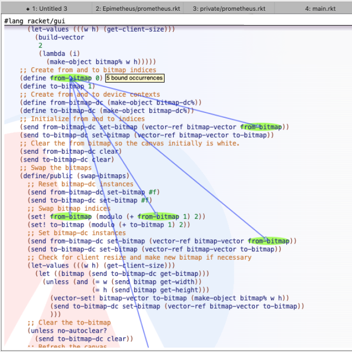
Although nTop is inspired by visual programming languages, this type of interface can only handle a small level of visual complexity. At nTop, we found that our users were reaching a high level of complexity in order to meet their engineering requirements. We needed something similar to the spaghetti code in the right image, which we quickly knew was out of the picture. While some users can comfortably navigate their own files by developing their own organization styles and techniques, the visual complexity made it very difficult to share and communicate within their team.
Instead of referencing node graph user interfaces, we started by analyzing contemporary text-based programming. Many programming interfaces have attempted to communicate complex data relationships with overlays and shorthand diagrams. How might we extend some of these concepts so that they can augment a visual programming language experience?
Ideation


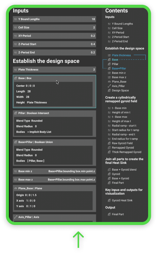

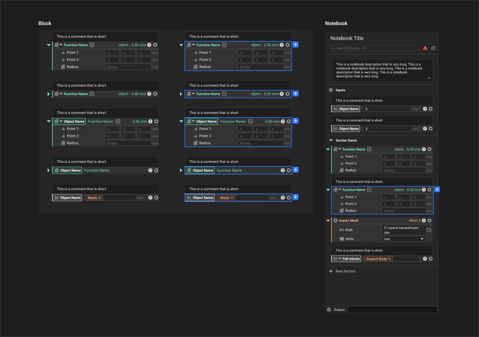
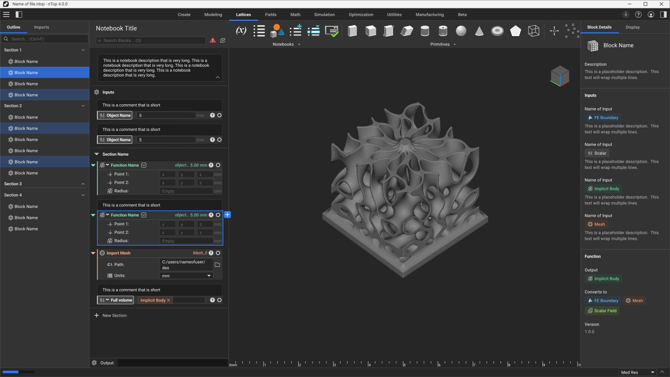
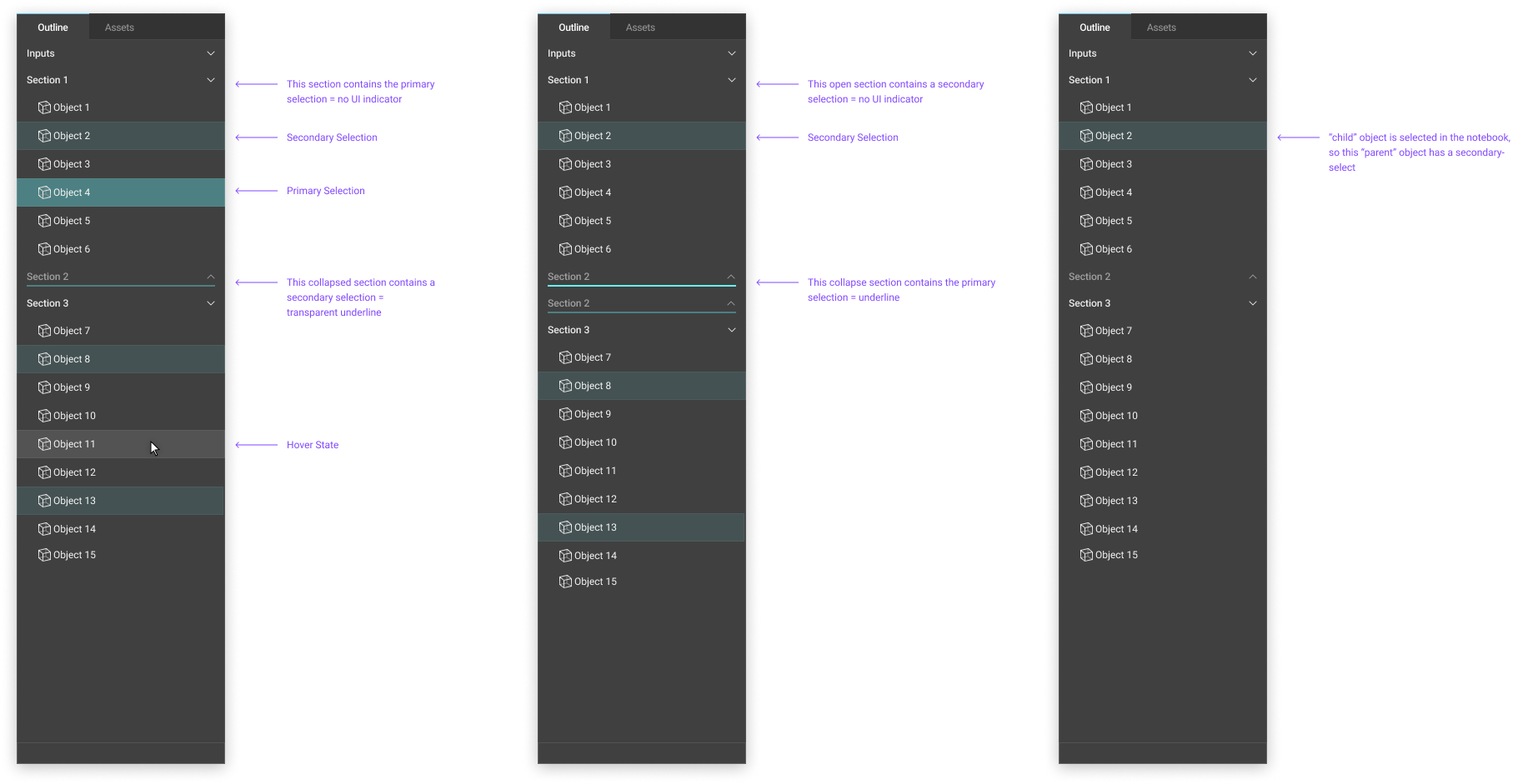
The Notebook Outline Panel
A design iteration of the outline in action. With the new design, a fairly simple nTop Notebook file could be reduced in height by about 5x, significantly decreasing the amount of visual complexity and mouse travel necessary to model a part.
Wireframes

The side panel approach required new thinking about our UI system as a whole. Formerly, nTop was meant to be a Notebook for programming geometry, and a viewport for displaying and interacting with it. With the Notebook Outline, we were beginning to envision the feature as the first of many that increased the ability for our users to more deeply embed nTop into their most complex engineering workflows.
To enable the vision of nTop as an engineering ecosystem, the application required a holistic panel tiling redesign. In doing so, we also saw the opportunity to better align the application layout to current design trends of design tools.
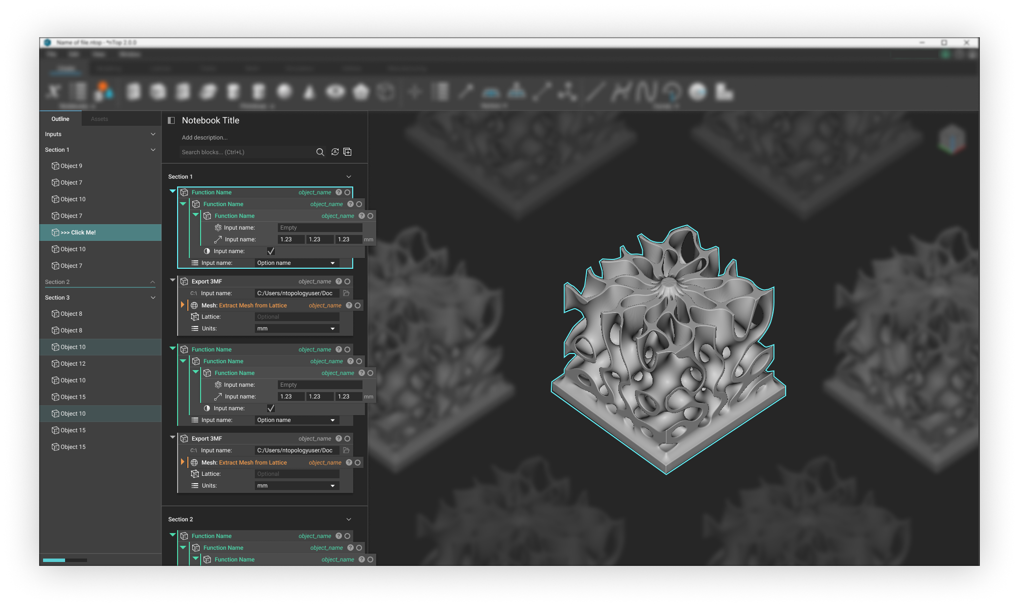
UI Components
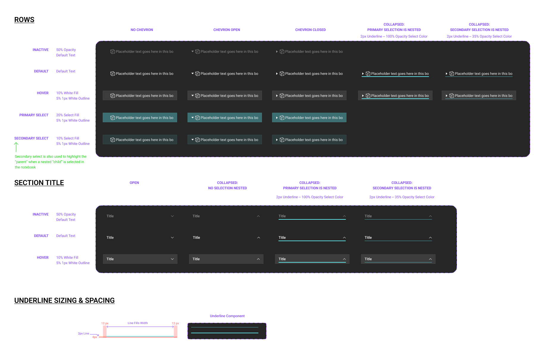
A scalable set of UI data tree items to be used in a side panel design. The outline was our first implementation of this UI concept in nTop, and it has since enabled and been applied to 10 other feature sets.
Panel Design
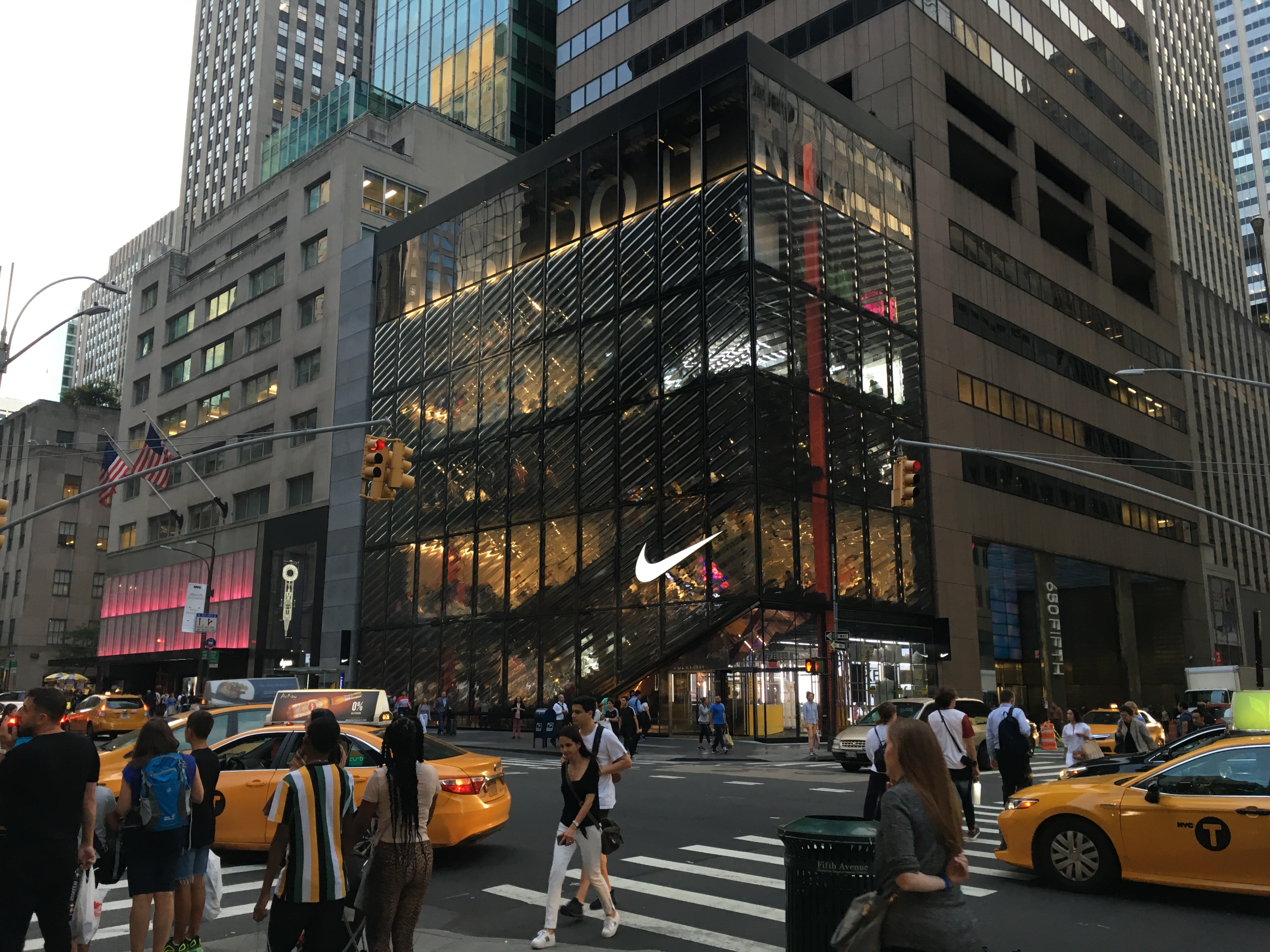
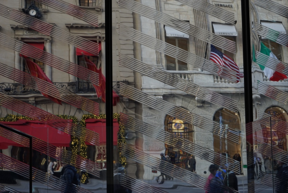
Park Ave
Concept design and design development for a slump-glass facade system applied to a flagship store in NYC, in collaboration with Mode Lab.
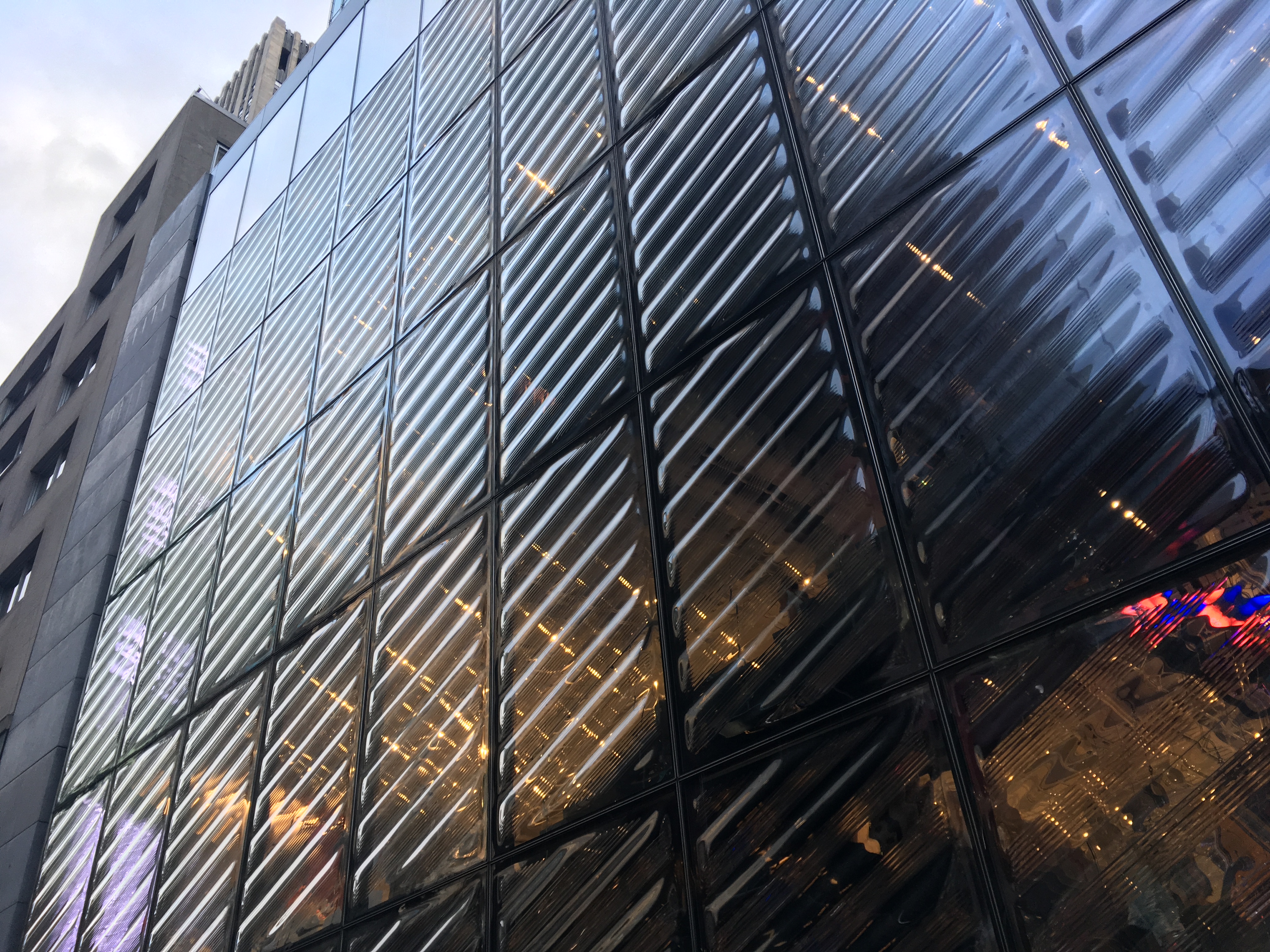
The rippled geometry and and frit pattern of the glass facade was optimized to reduce glare and solar exposure, while producing a hypnotic reflective effect of a city in perpetual motion.
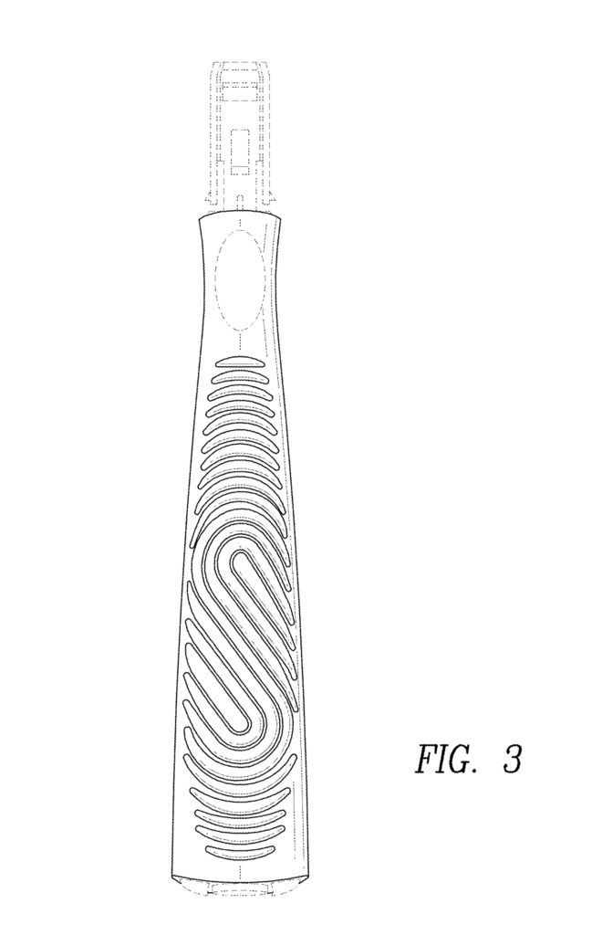
Razors
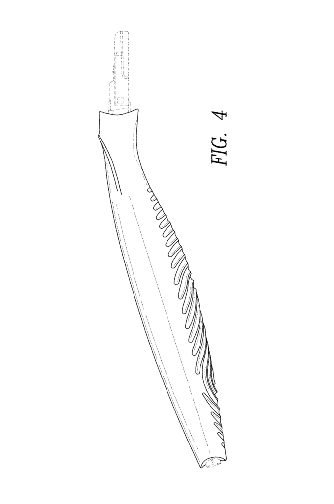
Concept deisgn and product development for a series of razor handles, in collaboration with Harry’s and Mode Lab.Flamingo
Instead of simply applying a texture to a product, we developed a 3D visual language to complement the Flamingo brand.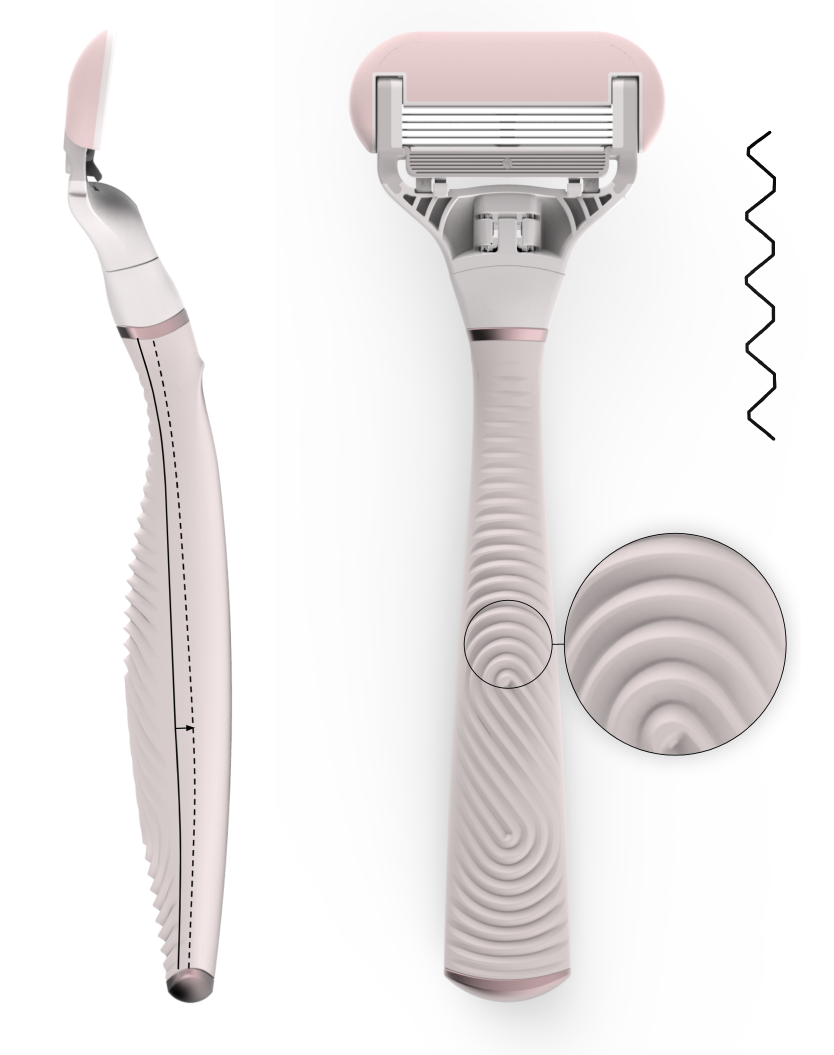
Design Tool
To explore the vast range of possibilities, we created a custom app that makes it easy to create and visualize custom texutures in 2D and apply it to any handle model. The application enabled our team to create textures procedurally, meaning we could easily apply the same geometric concepts and rules to a range of products across the Harry’s brand.
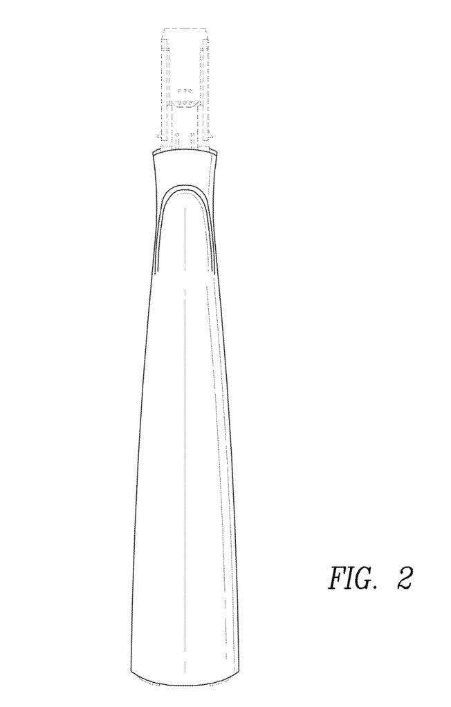
Harry’s Truman and Winston
In addition to the Flamingo razor, we applied the concept to several others, with each product reflecting a unique character.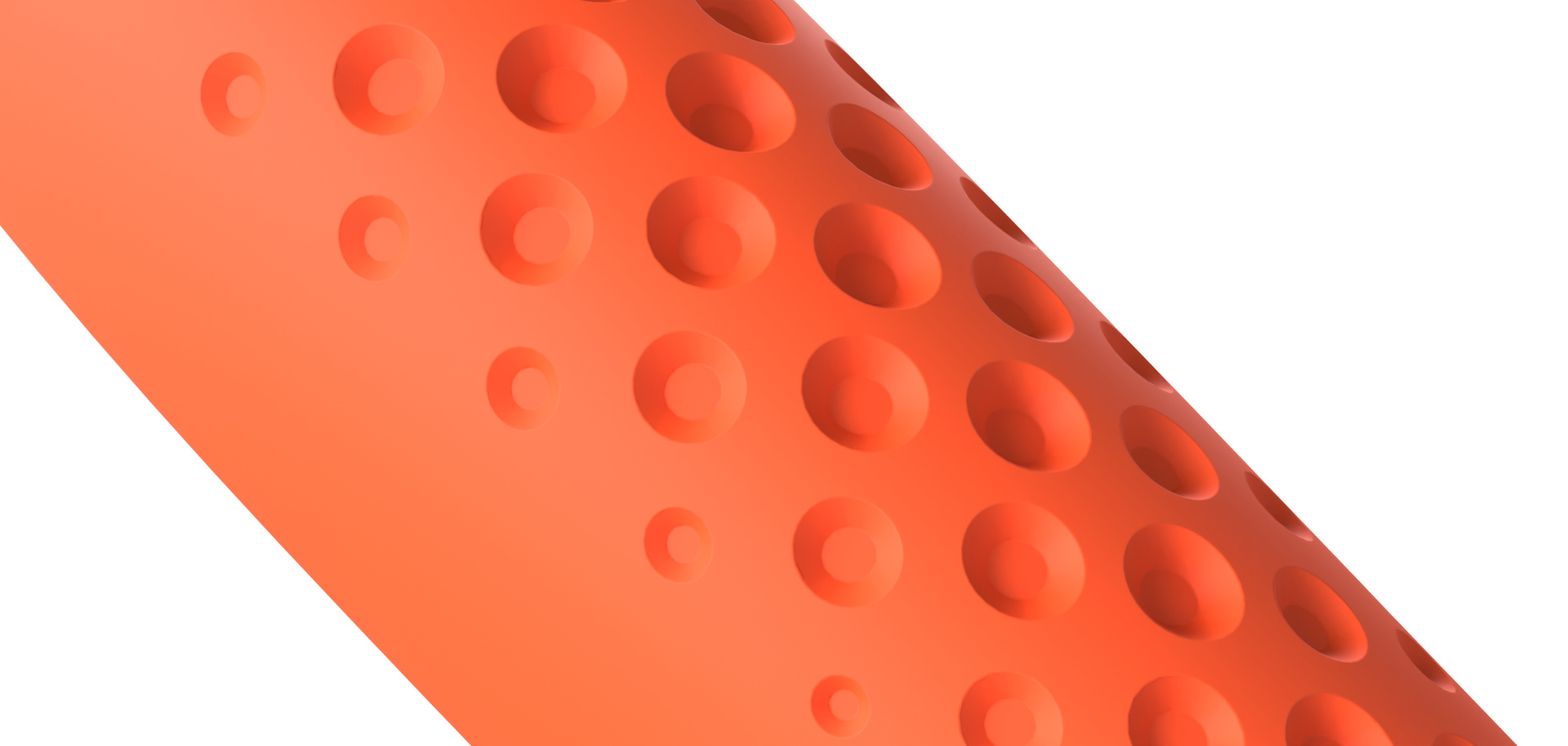
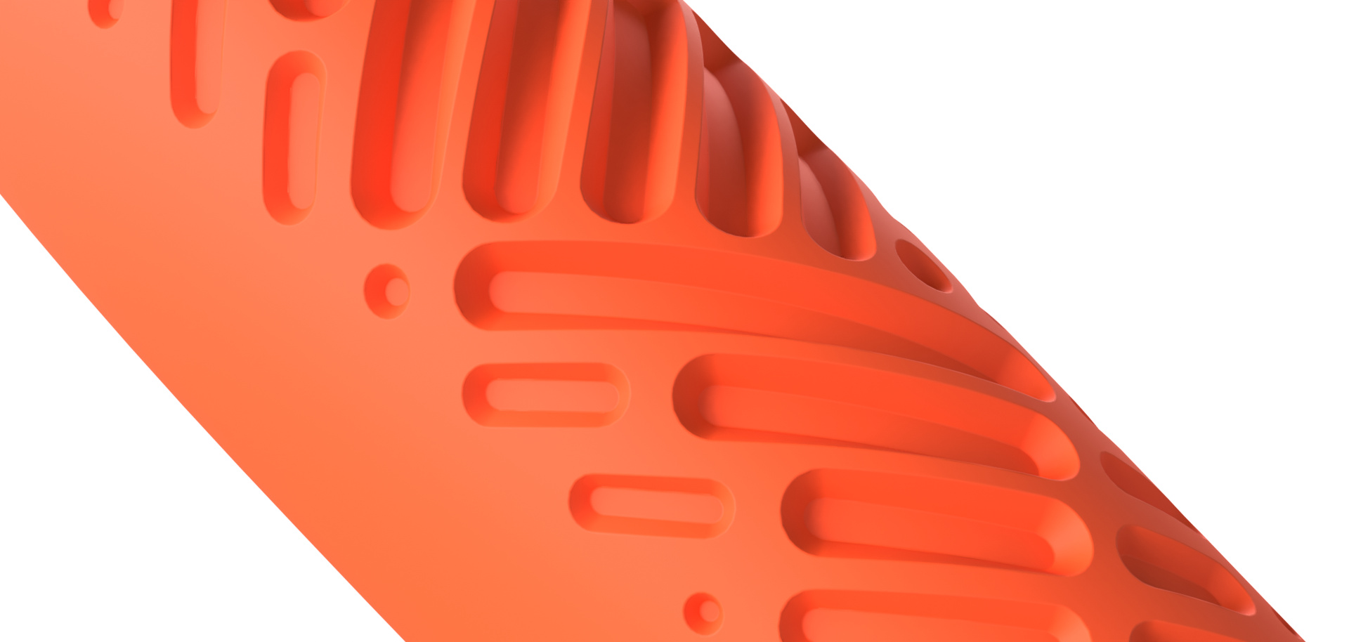


Geometry produced by the application is manufacturing-ready, enabling our team to go from concept to production-ready in minutes.
Shop
All products are made-to-order and printed on demand, produced locally in NYC.